Step #1 Selecting your theme:
- Go to your site and proceed to your dashboard
- Select Appearance > Themes> Add New
- Select “Feature Filter”
- Select whatever you would like, but you will want to select “Responsive Layout” under “Layout” This will ensure you will only be looking at the layout that will adjust to smaller platforms like cell phones and iPads.
Let’s talk “Layout”
Ignore the text. This was one of the hardest things to learn while selecting a theme. You are looking at the animation and layout. Pretend you can’t read. Layout basically refers to…
- Number of columns
- Number of menus
- Header Design
- Background
- Footer Design
- Animation
- Sliders
- “Featured” Selection
If you are a designer who wants to control your background, I propose selecting “Custom Background” under “features.”
Let’s talk “White wall.”
White wall is the term I use to describe that blank wall of white that covers up your background. White wall vs. background. You go to the trouble of finding, designing, uploading the perfect background, only to find that it is covered by this blank wall of white. When selecting a theme, you most likely will want to pay attention to the background vs. the white wall. This should be the first thing you consider while selecting a theme. In 50% of layouts, you can install a background that fills your screen only to find it is concealed by the white wall. This preference will play the majority in selecting your theme. How much “white wall” do you want on your website? You must decide on this first.
Have a look at
ApertureVersion: 1.1.4 By Michael Van Den Berg
This is a theme with no white wall. It allows you a full background and provides a faded black wall under white font. This theme is ideal for those designers looking for a dark sophisticated look and—unlike most black dominated themes—this one puts white text on black… a problem often overlooked with most black themes.
For that white wall affect view
MoesiaVersion: 1.35 By aThemes
Personally, I love this theme. My only set back is the quantity of blocky white covering up my background, which you get a good look at right off, so I can kind of forgive it. This is a theme I used for a while before changing it out for something with more code that met my needs.
Step #2. Familiarizing yourself
Once you select a theme, we can get started piecing it together. But don’t think you’re going to get the theme your download. What you see is only its maxed out potential. What you are going to download is the basic essentials to start building. No HTML code is needed, but you do need to know where to go to get the look you want. Nothing can help you here except some down time just playing with the theme (I can help with this).
I can’t tell you how many times I saw a theme I loved, downloaded and installed it. Spent hours building it only to decide a month later it just wasn’t what I wanted or thought I was getting. Accept that you will change your theme multiple times over before you decide it just isn’t what you want. BUT, every time you change your mind, you are all that closer to getting what you see in your mind.
And this is why WordPress is a beautiful thing! WordPress allows you to build and change without losing anything you’ve created!
Plan on a month. One month to learn the theme inside and out. One month to research and push the boundaries to see what it is you really have.
Let’s talk resolution
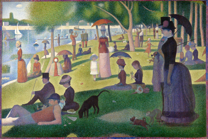
Resolution simply means how many pixels you have over a certain space. I love referencing George Seurat on this.
Tangent!
George Seurat was the French artist renowned for Sunday in La Grand Jatte.
In the 1880’s this man did by hand what wouldn’t be done digitally until nearly 100 years later. He is the founder of “the pixel.” Not really, but that is what I refer to him as. With paint brush and three colors only… THREE COLORS ONLY… blue, red, and yellow… George added not a single brush stroke. This entire painting (among all of his works) was done with stippling. Dots. Nothing else. Hand painted pixels. The painting is 81 and 3/4 inches tall x 121 and 1/4 inches wide. (207.5 x 308.1 cm) That is almost 7 feet tall!
I mean, three colors only. The “black” is really red and blue. White is not considered a color in the art world. White simply means, void of color. The French painter Claude Monet refused to use white and black because “everything has color.” White simply does not exist in the real world.
Almost all amateur websites have too low of a pixel count making the resolution very poor. This is the digital age, which puts hand drawings at a significant disadvantage. Use something too small, and your picture will appear grainy. Time for the visuals. This is my book… Dolor and Shadow.
Go ahead. Click on the thumbnail at 150 width. You will notice two things. 1 – You get a bigger picture. 2 – You have the option to zoom in at it’s full dimensions. The dimensions are 1600 x 2500. So if I blow this up, it will appear just as clear, just as pristine as a thumbnail and you can see every detail when zoomed in. I can change the size and not lose any of the quality.
Same picture. Just as clear. This is digital.
Now… have a look at this.
Click on the pic and you will see the full dimensions with no options to zoom in. Same picture, but the dimensions are 409 × 619. Now, if I were to make it bigger…
That is it’s full size. Where a lot of authors go wrong is when they take a picture with low dimensions and expand it beyond it’s dimensions.
Same picture. Same size, but it has lost its clarity. On digital, it looks fuzzy… out of focus. On hand drawings, it looks worse than a 1980’s DOS game on a Tandy.
When selecting your graphics, go high pixels. Go digital.
When selecting your graphics know the required dimensions. Try uploading a graphic to LinkedIn or Google+. You will receive a message, every time that tells you the minimum dimensions. I strongly recommend nothing less than 1600 x 2500. If you can go higher, do so! Higher is better. Always. HD=High definition. If you own anything HD or Blu-ray. You already are familiar with the difference. Carry over that same standard to your website.
“But I really… REALLY love my graphic.”
I’ll address this in a later article.
Coming up…
- Building your new theme.
- The basic widgets for authors that you want are:
- Subscribe
- Connect/Social Media Links
- “Currently writing” Progress Bar
- “Currently Reading”
- Recent Posts
- PLUGINS:
- For Spam and website protection:
- Akismet (the #1 barricade for spammers). This prevents spammers from posting ads on your site.
- SI CAPTCHA Anti-Spam (This provides a captcha to subscribers and will grossly reduced fake subscriptions)
- W3 Total Cache (allows you to empty “cookies” on your site to help it run better)
- For statistics:
- WP Statistics (I prefer WP Statistics)
- Highly recommended for authors:
- MyBookTable Bookstore by Author Media
- Extras:
- Comes highly recommended by professionals. I know very little about it. Google Analytics Dashboard for WP
- Mail Subscribe List
- NextGEN Facebook (NGFB)
- Mail Munch
- For Spam and website protection:
Some of my favorite themes.
- Adventurous (this is currently what you see on my site)
- Enigma-parallax By weblizar
- Aperture By hannibalbector
- “Moesia by aThemes”
- Evolve


